
Navigation is the manifestation of a user journey in your app. Make it natural and clear and your users will feel comfortable. The navigation design seems to be easy to implement, but the truth is more complicated. Proper information architecture design is a challenge. Advices described below will let you quickly improve your solution to meet the expectations of your users.
Although this tips works in major types of the mobile apps, remember to always validate them in your solution.
Construct the right hierarchy
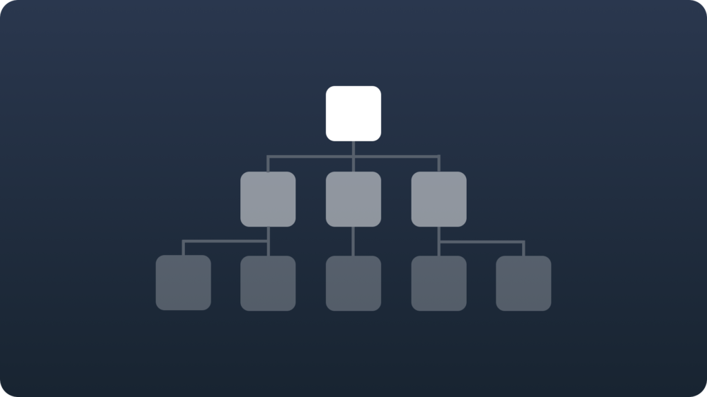
Organize your information structure to present most needed data instantly, finding the rest of them should require a minimum number of clicks, taps or swipes. It should also feel natural for your users.
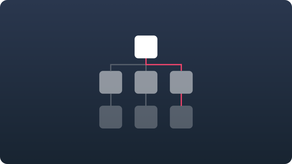
Design a clear path
![]()
Think of your solution like about the journey that user has to pass to accomplish his task. Try to help him in every step and identify the pain points to remove those obstacles before the app release.
Hierarchical navigation
A very popular pattern. User chooses the option and goes to the next level of navigation. The screens create a stack. To go back again to the first screen user has to tap “Back” button several times. It is important to make the structure not so deep.
Flat (parallel) navigation
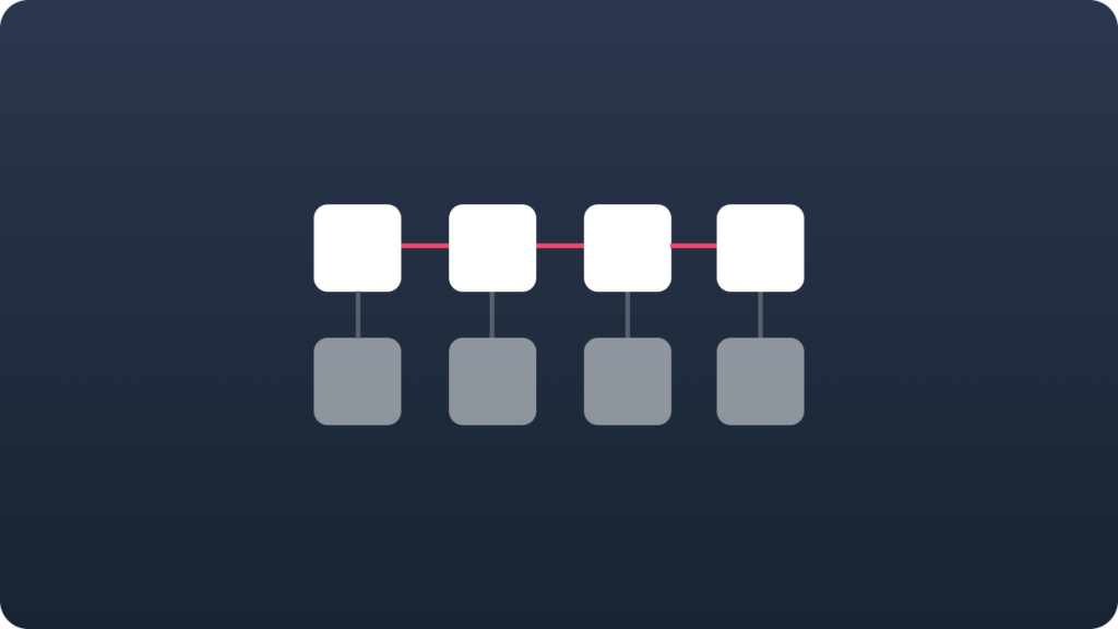
User switches between screens with a different content. The Tabs, bottom navigation and side menu are the implementation of the flat navigation. If your app has several functionalities that requires frequent interaction it may be a good idea to use this pattern.
Bottom navigation
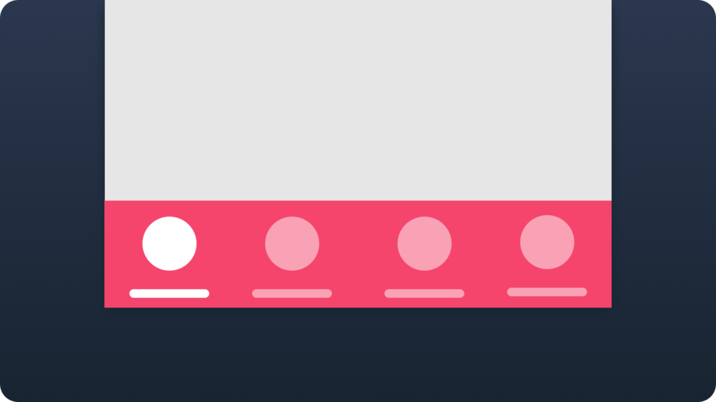
Recently re-discovered pattern. Originally, known as tabs from the beginning of iOS. Now it has a new name in the Material Design. Bottom navigation engages users much better than side menu. Pattern is really obvious for many people and easy to use.
When to use side menu
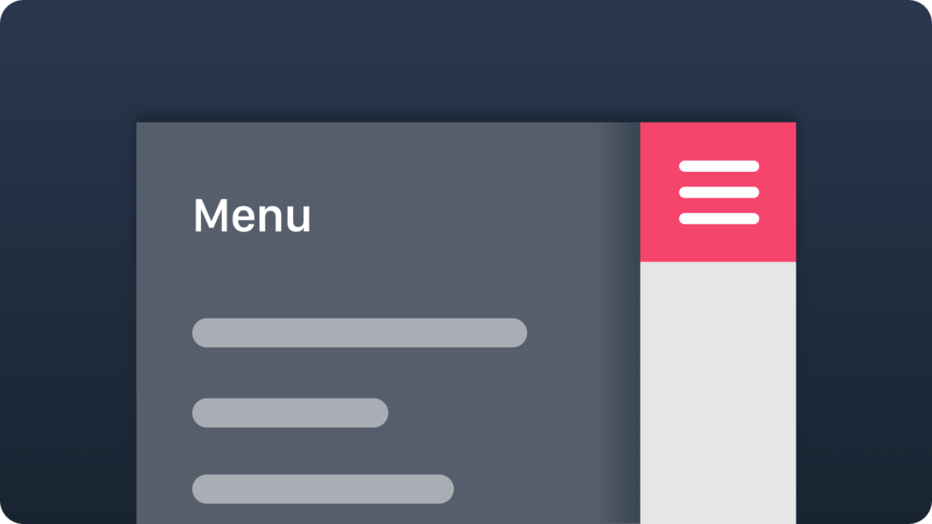
It seems that this pattern is going to disappear from most of the apps. It has been implemented to a lot of them, but possibly there are better patterns to realize parallel navigation. However, You may still use it and succeed with your app in some cases. One of them is the app with the one major feature,when the rest options should not have interactions with user for often.
When to use modal windows
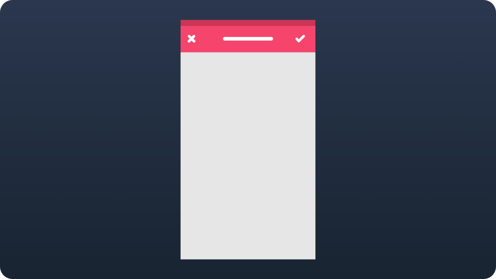
Modal screen encourages users to focus on a single task and prevent them from doing other things before they complete the current one. The Modal window should be a short task. Complex processes may cause situation when your users loose a context.
Use navigation bar (or action bar) to provide information about current position in the app
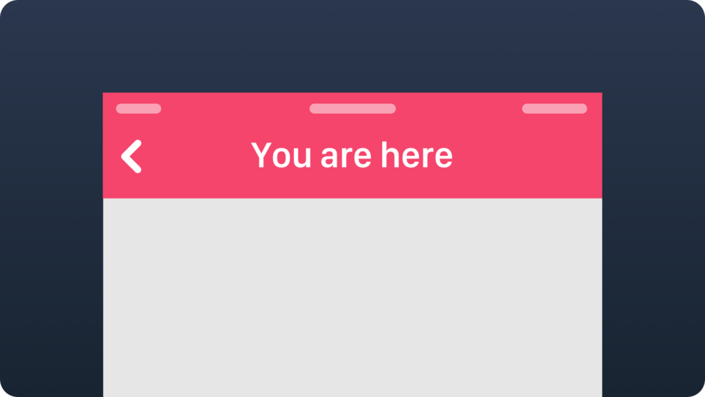
User should always know where he is in your app. The bars on the top of the screen is a natural element used for this purpose. You should not try to be original. Follow the pattern and your users will appreciate it.
Summing up
If your navigation structure will be well design your users will not even notice that you spend a lot of time to make it. It is a good news. Sometimes the true simplicity is really hard to achieve. A good navigation scheme always differ successful solution from the poor ones.
If you are one of the Designers who would like to get a unique insight to UX Design feel free to join to the UX Misfits Group on Facebook here!


