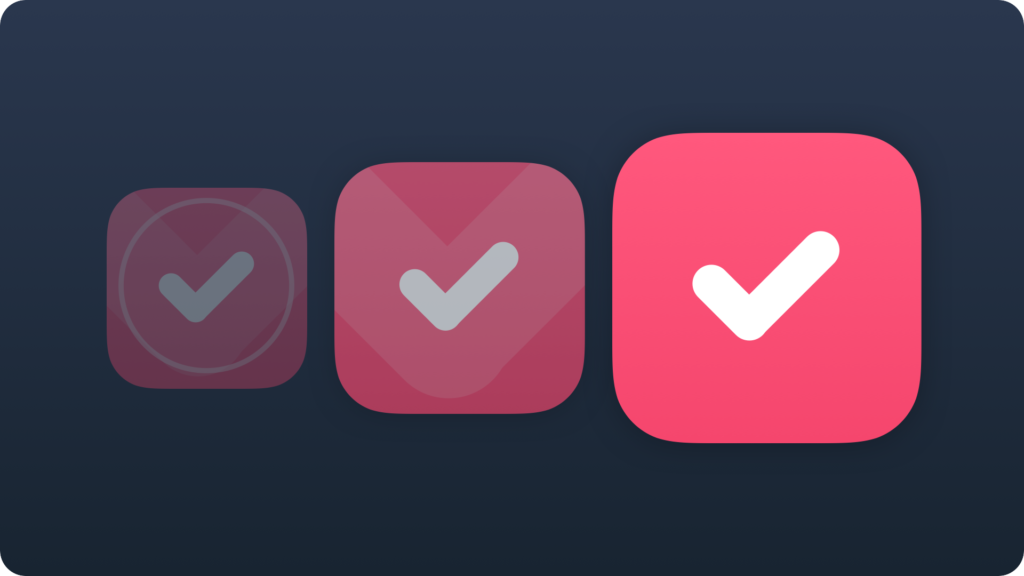
The beautifully designed application icon is important for success of your application. It plays a big role in a solution’s discovery when user browse the list of the apps in the App Store. Without an enjoyable symbol it is hard to create popular mobile software. So, how to make a great icon that will attract users? There are some advices to follow.
Emphasize your brand

Application icon is like the company logo. In majority of situations it is the point first interaction, the first impression. Solution should instantly communicate the brand of your company. This way it will become more credible.
Make it consistent with the app

Treat the icon like the doors that leads to your solution. This facade should be the beginning of the journey to your app. Every good piece of architecture is consistent from the outside and inside. Either your product should be.
Align icon to platform guidelines

All applications are part of the platform ecosystem. Our brains quickly notice things that do not match to the environment and see them as unnatural. Aligning to platform guidelines ensures that user’s eye will treat them as integral part of the mobile platform.
Make it unique

Being a copycat in a world of icons is a quick recipe for a failure. When users detects an imitation it will no longer trust the solution. Communicate values of your solution with care and do not just copy from other people ideas. All memorable symbols are unique.
Make it simple

Wise man said that the good logo of the company should be so simple that even a 5 year old child could draw it. Look around you, the big brands are this type of symbols. Your app icon design should have a similar simplicity.
Make it recognizable

User browsing apps usually see each app icon for a second or two. This is why your product should be recognized in a blink of an eye. Additionally no matter where someone would see the symbol (website or blog) he should automatically connect it with your application.
Use vector graphics

It is good to use a vector software to create a high quality icon design. Year after year the new devices with higher densities are appearing in the market. Your app design should be prepared to present in a highest quality. You should also avoid using photos in the launcher icons.
Test icon on various backgrounds

Some icons present well on a dark background, some look better on the brighter ones. Your users use various images and graphics as backgrounds, prepare your graphics for this. The symbol designed in a right way will always look appropriately.
Make it beautiful

All of us love the beautiful objects. Let your mobile product be one of them. Your icon should be like a little candy that everyone would like to eat. Take time to prepare a lovely icon. This investment should return in time.
Summing up
Remembering about this simple tips may significantly increase a likelihood of your app success. The poor icon design is one of the fundamental mistakes of the beginners in the mobile market. All of them are mentioned in this article.
Design your icons with a simplicity and the consistency with your solution. Make it unique, recognizable and always match mobile platform guidelines. Test your graphic design in the real environment. Use vector tools to create it. In the end your beautiful piece of art will be iconic.


