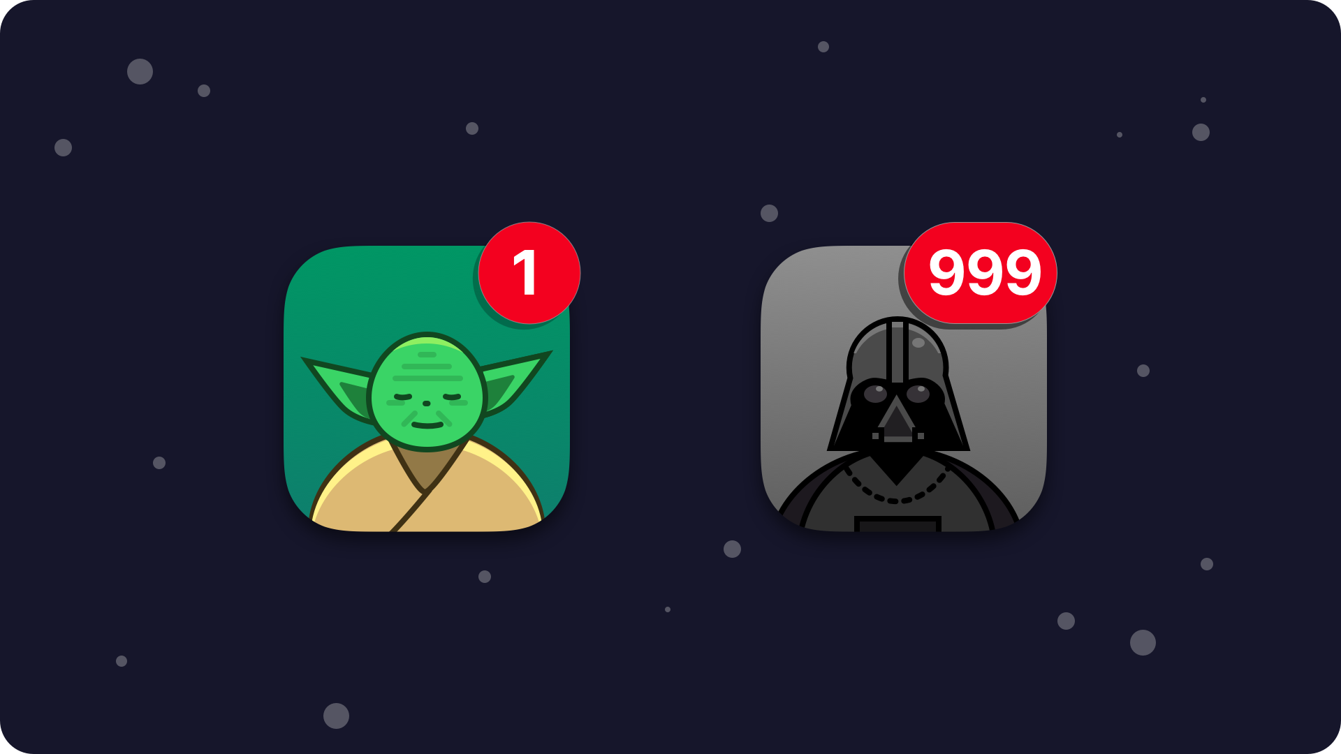
Try to think of notifications as of the mysterious force, the one known from Star Wars Saga. It has the dark and the light side – notifications can help your users or annoy them. It’s up to you how you will use this power. The light side will guide you through the path to create successful apps and please your users.
Notification design is a great challenge and because of that many User Experience Designers think of it as the set of anti-patterns. I don’t fully agree with this opinion. You have to remember that it is just a tool and it is up to you how to use it, for the good or the bad.
Why notifications are good for you and your users?
Imagine yourself using the mobile technology without notifications. You would have to remember to check your mail regularly. You could miss important meeting or a date, because you forgot to check your calendar. iMessage or Messenger would not notify you when someone sends you important news. In one sentence: typical day would become more complicated for you.
Notifications are helpful, they keep us up to date with our family, friends, and remind us of our plans. We don’t have to remember lots of upcoming stuff. Our apps will take care of it and remind us when necessary. Our busy day can become much more simpler because of well designed notifications. However, they also change our behavior from proactive approach to the apps into the reactive one. They can attack us by pushing messages too often. It is crucial for successful mobile solution development to implement notifications wisely.

5 elements of good notification design
Give your users control. If your users do not want to receive messages from your app, give them a possibility to turn it off easily. Maybe user would like to receive notification just for a particular category of events? Or your client would like just to change frequency of notifications? You should consider designing a settings functionality to cover those needs. Respect your users and let them decide.
Make content more personal. Lots of developers fill notifications with marketing slogans. Instead of that make message more conversational. Making short enjoyable text may be a greater challenge than writing a tweet. If you have possibility to use some of users data, use it to make message more personal.
Do not spam users. It is a thin line between the light and the dark patterns. Do not push messages to your users too often or you will annoy them. It is hard to say precisely how often you should notify them – it depends from the app type. Messengers, mailboxes and calendars should notify as soon as possible or in requested time. Applications with offers and coupons should not spam users daily. You can adjust frequency depending of the app’s usage. If your user do not browse the content of the app regularly even one message per week can be too much.
Use the context. What annoys equally as receiving tons of messages in a short time? Notifications that interrupt you in a wrong moment. Every app type have different rules to follow when implementing frequency of push notifications. Workout apps may remind you every morning or evening. App for event tickets of cinemas could show you something interesting once or twice a month in a Friday. Solution for meal ordering could remind you hour before standard lunch time. You can also use geofencing and notify users in a right place – for example shopping list in a store.
Use the force of the platform guidelines. Don’t reinvent the wheel. Mobile platform guidelines include lots of helpful materials.
Google’s Material Design patterns divides notifications as transactional and non-transactional. Transactional notifications are the ones that provide content that must be received at a specific time. They should help user to enable human-to-human interaction. They should also function better in daily life and control or resolve temporary device states (such as musing playing, or stopwatch running). Non-Transitional notifications are the rest of them.
Apple’s Human Interaction Guidelines for iOS allows developers to define two visual types of notifications. Banner that appears at the top of the screen for a few seconds while the device is in use, then automatically disappears. Alert that appears at the top of the screen content and have to be manually dismissed. Apple’s top suggestions is to make notifications useful and informative. Do not send multiple messages for the same thing, even if the user didn’t respond to notification. It is helpful for users to provide a detail view with intuitive beneficial actions (but not with destructive ones). App name or icon should not appear in the message. You can also use badges on the app launcher icon to inform user how many notifications are pending.
Wrapping up
Good notification design is one of the fundaments of Mobile Design. Android & iOS are transforming our approach to the apps. Intelligent assistants may become the front end of our smartphones. The notifications may play a big role in this world. Tips from this article will make your app more useful for the users and make it more successful. Do not let the dark side to seduce you while implementing them. Use notification wisely and respect your users.
May the Force be with you!


