
You’ve seen many times beautiful UI designs on dribbble.com which would not work in real apps. Moreover, they are often created by very talented graphic designers. So, what’s wrong with this mockups? What do this designers missed while crafting their graphics? The answer is: To create high quality user interfaces for smartphones you need to know basic principles of mobile design.
Improve your mobile mockups with following useful rules.
Remember: Context, context and one more time context

Desktop apps are used rather only in our homes or offices. Smartphone devices can be used everywhere. Become your user – go into the places when they use your app. For example if you are creating sports tracker – test your solution outdoor. It will help you validate concepts in the environment where it will be used by your customers.
Align design to screen size and user’s hands
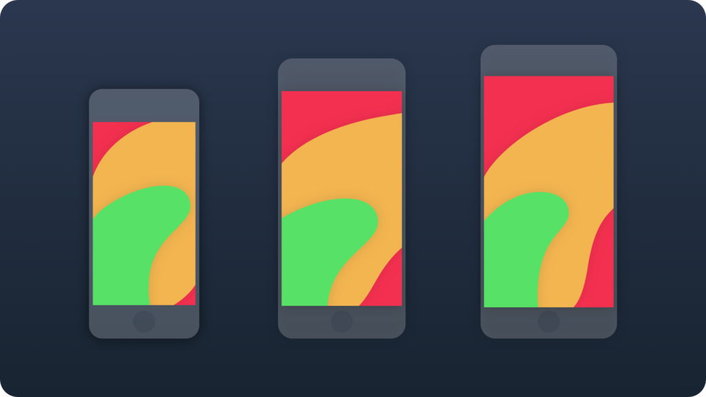
The first smartphones with 3,5 inch screens were convenient to use in one hand. But nowadays bigger devices rules in the market – 4,7 inch iPhone is a norm. However, majority of users still prefer to use device in one hand. This is the reason why you should plan to place primary actions in area reachable for user’s hand. This practice will increase usability of your solution.
Implement the right size of interactive elements
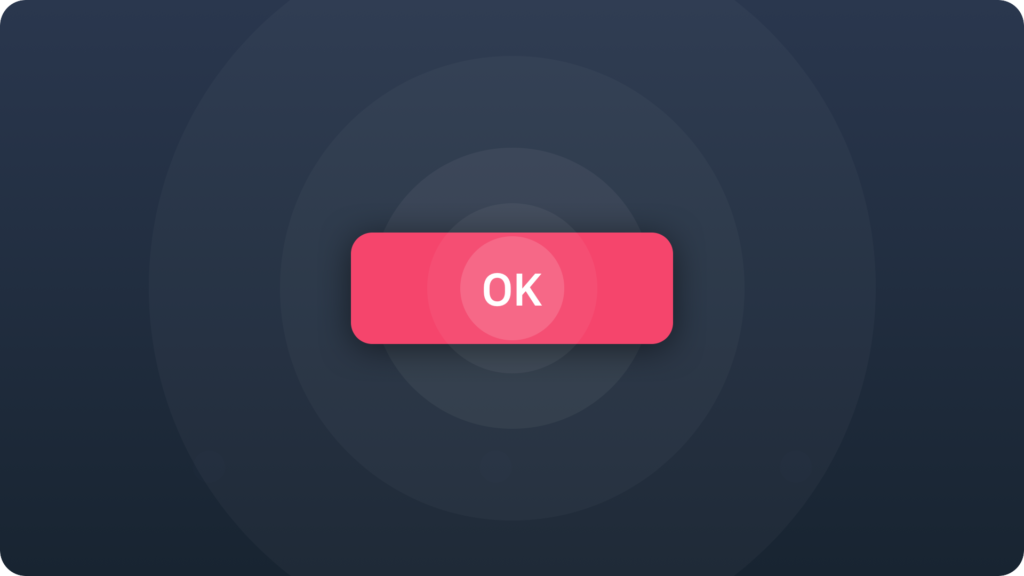
Mobile is different than desktop. You manipulate interface directly with your fingers. There is no precise pointer. This is why every touchable element of the UI should be enough big to be confidently pressed by your finger. The optimal size of every interactive ui control should be 9mm x 9mm, which is about 44 points x 44 points on iOS and 48dp x 48dp on Android. The minimum dimensions should not be smaller than 7mm x 7mm, but when you use this size separate UI elements with 2mm margin.
Focus on text readability
Too small text size can become a real pain for your users eyes.
Apple recommends that text should have at least 11 points for iOS apps. On Android it should be 12dp. This dimensions ensure that the content of your solution will be comfortably read by user.
Use proper spacing
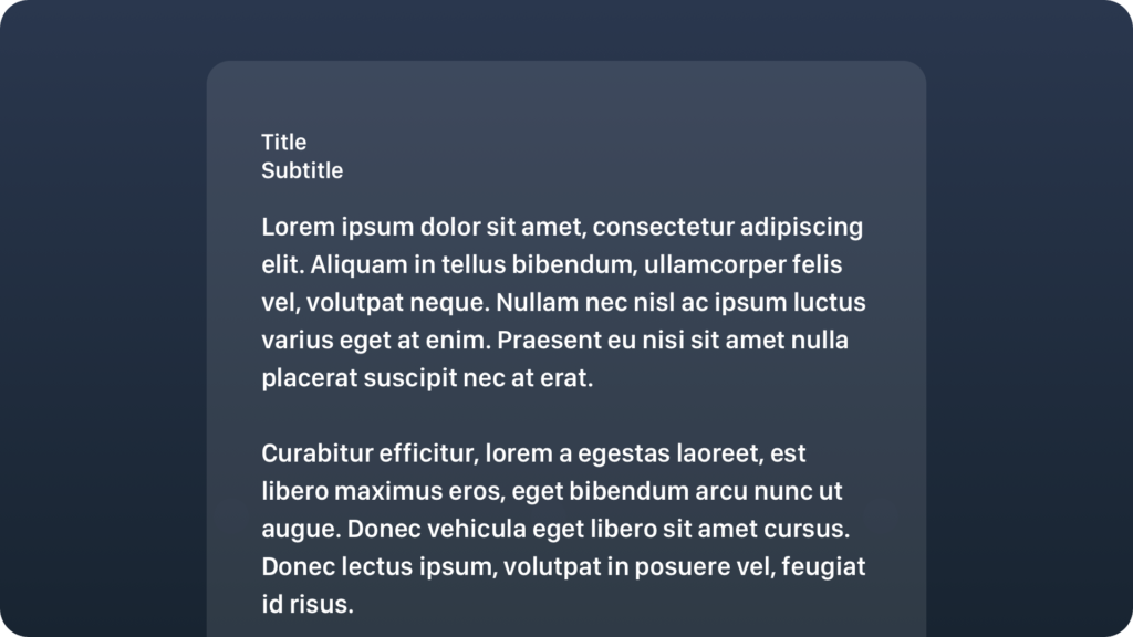
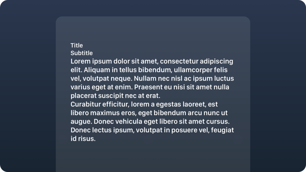
Placing elements on the right position and making them enough visible will have huge impact on your solutions readability. If your app has got a lot of text to read ensure that your content will have enough big line height.
Build right hierarchy
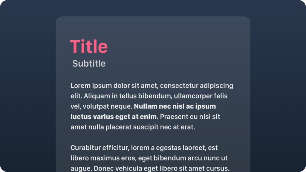
The proper spacing should be followed by creating appropriate weight of elements. Titles & headers should be visible at a glance when user scrolls down the list. The right element’s prioritization will make the app easier to use.
Ensure good contrast

You are creating an app that will be used by different people in different environment. Some of your users may not see some subtle color tones. Even text displayed in the right size can be unreadable if you will use wrong colors. Ensure that content will have good visibility for everyone.
Implement technology that is accessible for everyone.

You should use capabilities of the mobile platform accessibility modes that can be implemented in your app. iOS is known for its VoiceOver – great screen reader. On Android you can use Talkback. There are also simple ui design tips that will make your solution readable for people with color blindness.
Simplify navigation

User should not have impression that he is a part of an unexpected journey when he is using your solution. There are several navigation patterns (tabs, bottom navigation etc) that are really engaging and make application usage convenient. Take a pen and paper and draw the flow and navigation structure. This way you will be able to optimize & simplify it.
Remember: Obvious always wins
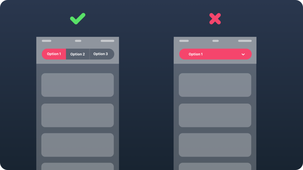
This famous sentence is often repeated by Luke Wroblewski. It tells you that you should expose core primary elements (primary action button or main navigation) on the screen. For example, if you have side menu in your app, consider switching it to bottom navigation. It should significantly increase engagement of your users.
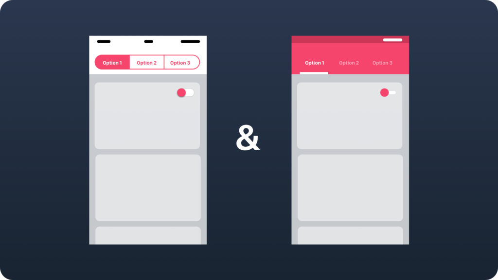
Follow platform guidelines

Creating apps that are not consistent with mobile OS can be a simple recipe for a failure. Both Apple (iOS) and Google (Material design) deliver comprehensive UI guidelines to design solutions that feels right on their platform. All popular apps are created with compatibility to this rules.
Ensure cross channel consistency
If you are creating one solution but for multiple platforms, first follow guidelines of each platform. Next ensure consistent information architecture. Navigation should have analogous scheme, content nomenclature have to be identical and UI elements should have rather the same type on the similar features. Users who switch between platforms will quickly adopt to a new environment and your solution will make great impression.
Make application fast

Research shows that users of the native mobile apps are much more impatient than users using web solutions. All designers and developers should know that making fast apps is the priority. Users do not want to see endless loader animation even if they are beautifully designed.
Engage users

Your solution should not be limited only to the application itself. All major platforms delivers additional possibilities like push notifications, widgets or shortcuts. This small interactive elements will encourage users to return into your core application.
Summary
The simple rules mentioned in this guide can be quickly applied to all apps you are currently working on. Tips may seem to be obvious but it is easy to forget about them when you are designing app quickly. Applying them will make significant impact on your app popularity and user’s satisfaction. If you would like to start designing quickly with good quality resources check out iOS or Android graphic materials.


